Nearly two thirds of marketers and brands are not optimizing emails for viewing on cell phones, according to the combined estimates of email agencies interviewed for this story. What’s holding them back? Fear. Fear of the massive undertaking, of the choices to be made, of the allocation of resources. But fear not, marketers, the problem may not be as daunting as imagined. The following are some ameliorating considerations:
- Don’t worry about tablets. Emails designed for desktops work fine on them.
- Most likely, only the rare campaign will require custom coding for individual emails. The majority can run from one responsive design template—meaning only one up-front coding cost.
- Responsive design is not mandatory. Marketers can avoid big coding projects altogether by using one-column formats and minimal images that work on mobile screens, as well as desktop screens.
Wacarra Yeomans, director of creative services at marketing services provider Responsys, deals regularly with clients confronting mobile optimization for the first time and has devised a list of beginners’ tips for them, including:
Know your audience: Before doing anything about mobile optimization, conduct analysis to determine on what screens customers are opening their emails. Desktops? iPhones? Androids? If less than 30% of opens are on mobile devices, hold off on investing in responsive design.
Keep it simple: Basic optimization requires but a few simple rules. No self-contained images. Use a blocky design with a one-column format. Bump up the size of the typeface; 14-point usually does the trick. Yesmail Creative Chief Matt Caldwell uses a simple test: Take the company’s standard email typeface and reduce it to half its size. If it’s still readable, it will be readable on a cell phone.
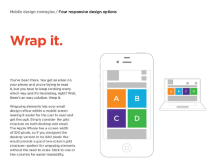
Minimize responsive design costs: This coding technique senses when an email is being opened on a mobile phone and presents it in a readable fashion. The keys here include formatting email art and text elements in “blocks” and arranging them neatly so that they can be swapped, or restacked, on the narrower mobile screen in a logical pattern.
Don’t run; hide: Many email marketers believe in lengthy sell copy for their products. This works for desktop consumption, but copy has to be significantly shortened for mobile users. Blocks of text can be coded to be “hidden” when opened on a mobile device. The same can be done with images.
“If you have the discipline to stick to a template, responsive design is not prohibitively expensive. It’s basically a onetime cost,” Yeomans explains. “You can always spend a little to customize the template for a special campaign that demands it.”


