Stella Artois
Content-rich Web site leaves no aftertaste
Situation
InBev’s Stella Artois wanted to increase global brand awareness while also giving its online presence a much-needed overhaul.
“The digital offering for the brand was very poor, flat and corporate,” says Neil Gannon, global brand manager of Stella Artois. “The info was there, but it was so un-Stella Artois-like.”
Approach
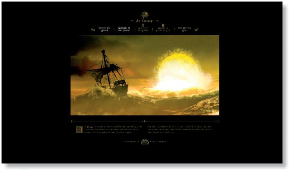
Stella Artois tapped advertising agency Lowe London to develop content for StellaArtois.com. The flash Web site, which launched in September 2007, shows visitors a film upon entering. Visitors can pause the file to navigate to other sections, including a history of the beer, Stella-themed challenges, the brand’s advertisements and an interactive game showing how to pour the perfect pint, which players can challenge others to with a send-to-friend feature.
The site is currently available in six languages. It was promoted through out-of-home advertisements, banner ads, SEM, TV and in-theater spots, and bloggers throughout the US and UK.
Consumers “are looking for different and compelling content but also experiences,” Gannon says. “Stella Artois was keen to make sure all the different zones were a sufficient challenge and not fairground attractions.”
Results
The site’s traffic has increased tenfold since the relaunch, with 25% of visits a result of consumers directly typing in the URL. The average visitor spends six minutes on the site. -Mary Hurn
Marshall Engines
3D mailer revs up leads
Approach Marshall Engines initiated a direct mail campaign last fall after a major competitor went out of business. The company had used flat mail for years to promote its remanufactured engines. This time it went with an American Slide Chart pop-up mailer in order to convey a commanding brand presence. The piece was mailed to 5,500 auto parts stores from a purchased list.
Results The response rate to the mailers was 5%. –Chantal Todé
Ergo In Demand
Site search is ergonomically correct
Approach Ergo In Demand looked to Mercado to optimize the online shopping experience for buyers of the brand’s ergonomic office products. In November, Ergo’s Web site relaunched with better site search and navigation capabilities.
Results Ergo reports that customers using Mercado’s search box convert to sales at a rate 15 times higher than other customers. –Nathan Golia
Privateview
Michael Ventura, creative director, Seed Gives Life
Beautifully directed videos abound in this work from Stella Artois’ agency Lowe. The art direction of the site, as well as the videos, effectively target the brand’s core consumer: affluent, discerning beer drinkers. The breadth of content here is smartly segmented by short pauses where users can opt in or out of viewing more video vs. going deeper into the brand content of the site. All in all, a wonderfully surreal experience that leaves the viewer wanting more and ready for a drink.
The work developed for Marshall Engines is a little too straightforward and conventional in its design and copy. For the pop-up mailing, the window was wide open for the brand to do something smart and engaging. What we got instead was a 3D static print ad. Though it might resonate for consumers who aren’t used to receiving a promo in this format, the brand may have missed the mark on an opportunity to do something truly different with this sort of promotion.
Tactically speaking, search is probably one of the most important functions on an e-commerce site — especially one with more than 500 SKUs. The thinking behind Mercado’s approach to usability for Ergo In Demand was intelligently executed, and the metrics from the site seem to back this up. Additionally, the staff picks section was a good way to cut through all the clutter and offer up products that are most popular — short of developing a full-blown CRM system.