Hoover’s
Work in the fast lane
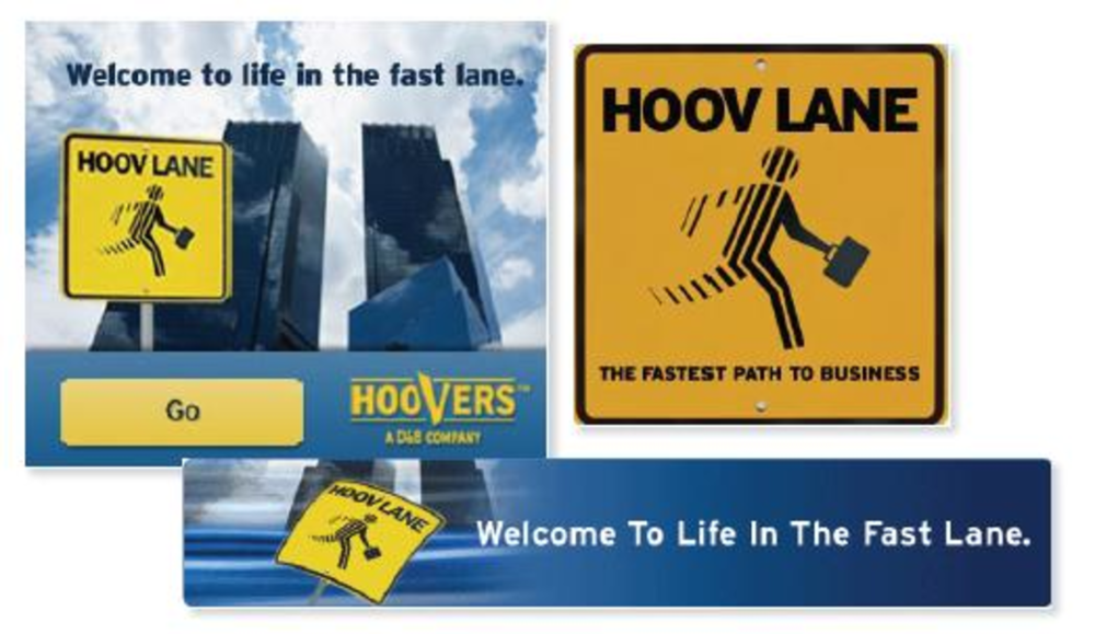
Situation
Hoover’s, a subscription-based Web site for business information, faced growing competition from free sources of information, such as Google. The brand was looking for a way to tell people why it is the best source for business information while showing how Hoover’s can bring value to an organization.
Approach
Hoover’s collaborated with interactive agency Click Here to launch the microsite “HOOV lane” in May, playing off the high occupancy vehicle — or HOV — lane meant to encourage carpooling on highways in some major cities.
“The HOV lane gets business travelers to their destination quickest,” says Sharman Creasey, marketing manager at Hoover’s. “The ‘HOOV lane’ gets our business user to the information they need in the quickest [way possible] so they can get the job done.”
The site features flash animation to simulate rapid movement, which “slows down” to focus in on specific messages. An ROI calculator demonstrates how users can save time and generate money with the site. Throughout, Hoover’s is inserted into real-life business scenarios to show how the site can help.
“Instead of just putting an ad in front of people, they’re getting entertained,” Creasey says of the microsite.
Hoover’s is driving prospects and customers to the microsite with print advertising in niche business publications like Fast Company and Inc., as well as with banner ads on these publications’ Web sites. It also ran a video ad in Times Square and some e-mail blasts.
Results
The site averages 2,000 unique visitors per month. About 10% use Hoover’s to do more research — they’re viewing twice as many pages as referrals from other sites. -Chantal Todé
Indiana Botanic Gardens
Vitamin site gets a boost
Approach: Nutritional supplement and beauty product retailer Indiana Botanic Gardens tapped Escalate Retail to relaunch its Web site in May. The new site features updated design, better navigation, cross- and up-sells, and sales in real time.
Results: Conversion rates on the new site have risen 17%, and the average number of items per order is up by 31%. -Mary Hurn
Dunhill Vacation News
Lead network flies high for travel newsletters
Approach: E-newsletter publisher Dunhill Vacation News promotes travel deals toa wide range of consumers. It worked with Pontiflex to test Web sites with audiences across several demographic and age groups, looking to identify which of these audiences would be most receptive to receiving its travel offer newsletters.
Results: Leads from Pontiflex have outperformed other sources, with open rates jumping 30% in nine months and click-through rates up more than 35%. -Nathan Golia
Alan Gilleo
Creative director, LeapFrog Interactive
As co-founder of LeapFrog Interactive, I must admit I did spend some time on Hoover’s HOOV lane site exploring its features. Any executive or manager is always looking for a way to increase efficiency and reduce cost, and the site demonstrates this quite well. It is very well done — graphics and Flash are sophisticated and eye-catching. The voiceover is extremely effective — not boring or long — and keeps the flow going quite nicely.
I had to dig out the Wayback Machine to see if the Botanic Gardens Web site had actually changed. I felt like I was stuck in the good ol’ days of ’90s Web design — the days before designers got a hold of the Internet. Yes, the design could have been made more contemporary; but it really is a dramatic improvement to previous versions. Navigation is much clearer and robust while the different search tools help users find an impressive amount of product.
This is a tough industry in which to come across as credible, professional and legit — kudos for accomplishing that. Concept: Get all your travel tips and savings right to your inbox from Dunhill Vacation News. Don’t waste your time searching the Internet for coupons and savings. Who wouldn’t want this? Execution: OK, when the advertiser’s site buttons look more creative then your banner, well, I’ll leave the rest up to you. The good news is that users are probably not as likely to dismiss the content even though the look isn’t there.