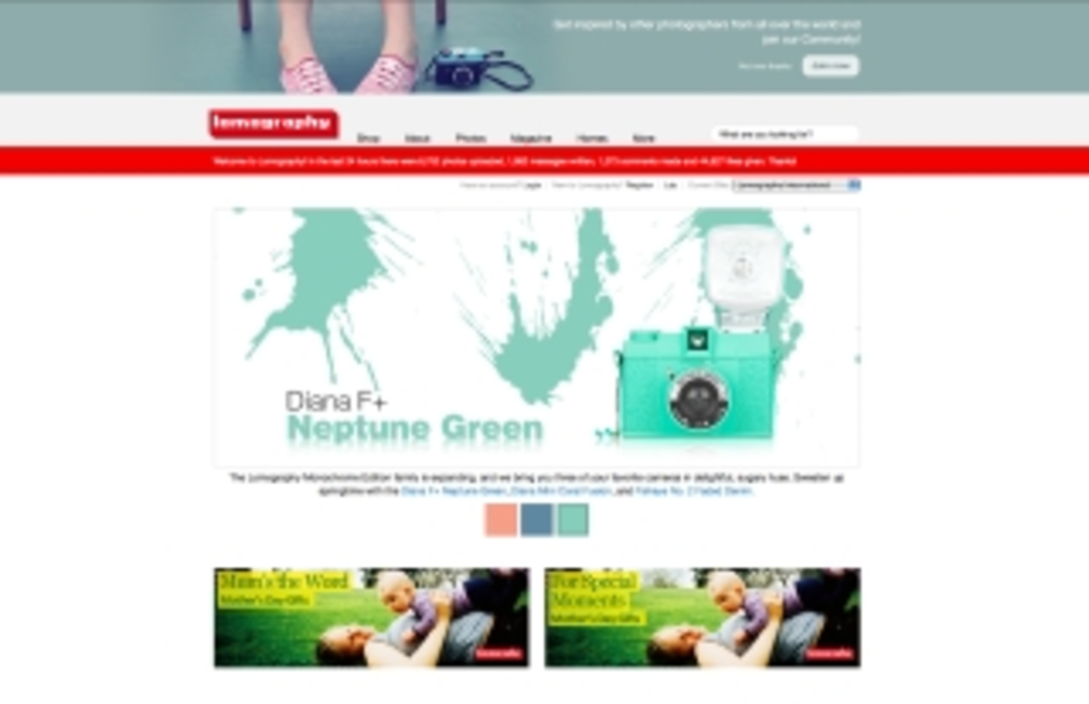
As befits a shop for lo-fi cameras, the landing page of lomography.com is pleasantly image-heavy, with a large banner ad showcasing new products.
The site caters to its tremendous fan following, incorporating elements of social networking to display and catalog user-submitted videos and images by date, geography and even color palette, as well as a magazine written by lomography.com fans, with product reviews and features about anything associated with the “analogue lifestyle.”
The e-commerce shop itself is broken away from the landing page, as it opens in a new tab — a slight nuisance. As with the landing page, the e-commerce site heavily features a large banner ad with a product or set of products (“Premium bundle deals”). The various product categories are buried beneath the banner ad and require some scrolling to access.
When users click on a specific camera model in the menu, a sub-menu opens up listing accessories, mini-versions of the model and bundle packages. Additionally, each product category has an icon next to it depicting one of the items within that category, which gives shoppers an idea of what each model looks like.
Check out more e-commerce sites and see how they rated: