


Last week, Mashable editor Matt Petronzio noticed something very strange as he refreshed his Twitter profile page. Instead of the familiar vertical stream of text messages in a large blue column to the right, all his tweets were now posted as tiles out of sequence, while his profile picture shifted all the way to the left. It looked, inexplicably, like his Facebook page.
Petronzio was one of the few Twitter users on which a new platform design was being tested. Turns out, Twitter was quietly experimenting with changing the look and feel for the Twitter profiles of a handful of random users. It’s been known to roll out redesigns like this in the past, but nothing as drastic as this.
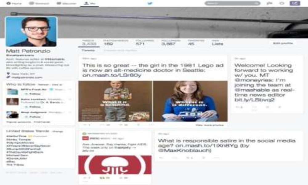
Check out what the new layout looks like here (image via Mashable)
So why would Twitter, which had long touted itself as the anti-Facebook try to look so much Facebook? In a word: engagement.
Twitter’s user growth hasn’t exactly been great, growing only 3.8% over last quarter. Wall Street wasn’t too happy about that, especially since the company had just gone public and spent a whole lot of money increasing its visibility, especially among advertisers. Twitter’s stock plummeted after its first earnings call, and CEO Dick Costolo was put through the ringer by analysts and journalists questioning the platforms slow growth.
Costolo had indicated on the call that users could expect to see more multimedia images in Twitter feeds instead of the traditional 140 characters text messages. “We simply need to make Twitter a better Twitter,” said Costolo, also emphasizing that it was now time to go after people who weren’t naturally inclined towards Twitter, i.e. removed from pop culture and the media elite. He also said it was also the platform’s goal to get people on board more quickly and help them intuitively understand how the whole thing works soon after joining.
The new design may be visually more appealing, and with its similarity to Facebook it might be a more familiar interface for new users. But it’s lost what was Twitter’s most endearing quality, which was simplicity. The physical restraints of 140 characters and everything happening in real time are what made the platform unique, and it was unencumbered by a ranking algorithm or haphazard spacing. You saw tweets as people wrote them, new ones on top, old ones at the bottom. There’s just too much happening in the new redesign.
However, Costolo is right about multimedia content being more engaging. A few months ago, when Twitter started showing images and Vines directly in the feed rather than as links, it broke up the monotony of text and made tweets more entertaining to read through (even if there was the risk that something NSFW could just pop-up in the middle of your feed.) One hopes that Twitter can find a way to bring more of that multimedia element without compromising the core appeal of its platform. For now, its still just an experiment, albeit one that left plenty of loyal Twitter users enraged.
@mashable hate it. Can’t think of a better reason other than its not very ‘twitter’
— Glenn Walker (@glennawalker) February 13, 2014
@mashable horrible, everything that twitter isn’t is in that design
— ralphyyyyy (@Ralphyyyyy) February 13, 2014
@mashable what an ugly mess that is. Lets keep @twitter like Twitter should be. No need to copy others
— Rashid Khan (@rashidkhan_6) February 13, 2014


