


The global navigation bar on bn.com tells a story for those with a critical eye. Tab 1: Books. Tab 2: Nook Books. Tab 3: Nook.
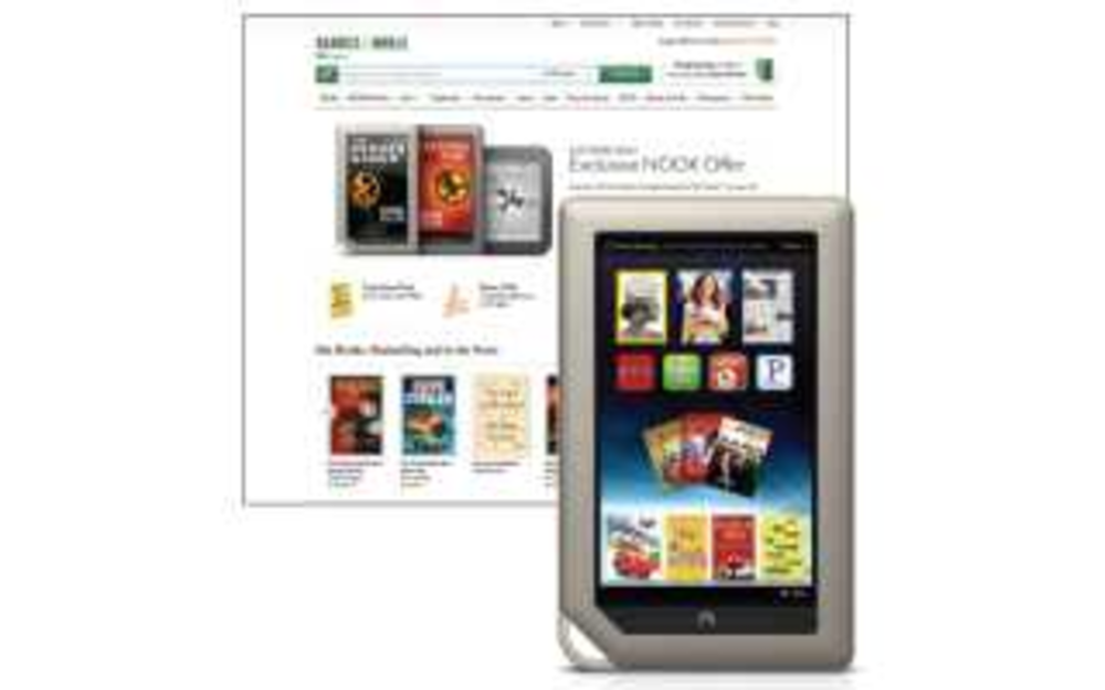
As an e-commerce destination, the Barnes & Noble website is relatively easy-to-use — the predictive searching function is helpful, the design is clean and simple, the “Wish List” page for account holders is handy and products are broken down into sensible categories — but the prevalence of Nook-vertising on the homepage is overwhelming. Bn.com is more than just a bookseller, but where are the books? Promoted on the homepage at one point were the Nook tablet, an electronics sale, Aftershokz Earless Headphones and “paranormal romance faves,” the only reading material in sight.
For those who aren’t Nook owners, the seeming lack of actual books for sale is an irritant. When searching for “Sense and Sensibility by Jane Austen,” for example, the results page populated with three e-books, one Nook ad and one real paperback.
Bn.com also misses the social sharing mark. Though there is a social networking layer on the Nook itself, one would be hard-pressed to find anything on the Barnes & Noble website other than Facebook and Twitter icons hiding at the bottom of the page.
Check out more e-commerce sites and see how they rated:


