Clusters are now the latest way for marketers to discover new customer segments
Marketers face a plethora of advanced analytics techniques. R programming has become a popular choice for advanced analysis, particularly clustering. Clustering is a machine learning algorithm that determines how observational data should be grouped together. The observations can be anything you represent with data, so you have an opportunity to learn how your data – whether it represents people, products, or services – relates, based on shared characteristics. You can then plan your marketing around those characteristics.
Shared traits
Clustering works based on the shared statistical traits of observations in a given dataset. Programming languages like Python or R Programming are used. In this post I am using R to show one way to conduct a cluster analysis.
Setting up a data analysis starts with importing data, be it by a csv file or by API to a database.
For this example I am using one of the datasets built in R called mtcars, a table of vehicle specs provided with R programming. (R provides a number of datasets to practice, though the models listed are quite old.) To imagine the value in a business setting, picture my role in this as a program manager seeking a potential vehicle segment based on vehicle horsepower and gas mileage specs in the mtcars data.
After checking for anomalies in the data, I start to apply library functions to those variables. Libraries are plugin programs that give users access to features, such as mathematical calculations, programming functions or access tokens to retrieve data from an account. Thousands of these libraries exists, tailored to database platforms, social media, geo-location, and data sources of all kinds.
For this instance use the following libraries:
- Cluster – the key library that provide clustering functions
- Factoextra – allows the function to create the K means graph
- ggplot – for adding an x-intercept (more on that in a moment)
- Psych – this is an optional library that provides cluster stats, as needed
To begin an analysis, the data is placed in a data.frame – a variable that contains the data. Columns in the data are made null to center on details related to hp and mpg.
Some of this may be technical in the code, but where marketers can offer guidance is the trial k-means number – the number of clusters that should exist in the data.
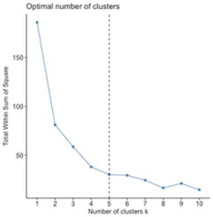
It is customary to insert a trial k-means value, and then create the graph of SSE (sum of squared error) values versus k-means values. Doing so is based on some experience and intuition about the data, as its purpose is only as a starting point. In this case I assume three potential segments of cars.).
This is what should be displayed once k-means is run and the clusters of vehicles are plotted with ggplot. Each color in this case shows a cluster of vehicles based on the attributes related to mpg and horsepower.
The next step is plotting the sum of squared error (SSE) versus potential K-mean values. SSE is a sum of the squared difference between an observation value and a mean of the observations. Its purpose is to measure the accuracy of the clusters – a low number implies less variation in the results.
The factoextra function dviv_nbclust calculates the SSE versus k-means graph. The geom function from ggplot displays an x-intercept that represents the chosen optimal cluster.
To select a k-means estimate, you move along the curve from right to left, seeing the SSE decrease until you find an “elbow” where a decrease in SSE appears small. The elbow indicates the optimal number of clusters. In this example, I selected my k-means to be 5.
You can then rerun the cluster analysis with the chosen k-means. Here is a graph of the data clusters, this time displaying the results based on k-means equals 5.
Usually clusters are highlighted with a circle encompassing the observations. In this case, colors are used. In the graph new groupings appears within the clusters above 21 mpg/below 100 hp and below 20mpg /above 200 hp. These reflect new segments that a manager may want to explore in relation to marketing ideas.
That discovery is the point of clustering’s value. Clustering allows data exploration of overlooked patterns and potential relationships. Exploration is why clustering is popular for marketing research – in many instances there is a lot of data but very few indicators of trends that reveal associations.
What’s the opportunity?
For the cars example, had I examined the cars listed from just my experience, I would have potentially overlooked vehicle segments that I could have addressed with a new product or a variation of a current offering. Over the years many automakers have offered a vehicle meant to cover unique segments and have used facets like mpg and horsepower as talking points for marketing and sales teams.
More to the point of digital analytics, clustering allowing users to link characteristics to a business model fast, rather than within a given arrangement of dimensions and metrics. Marketers can infer more nuanced characteristics to act upon than those from a default label seen in an analytics solution, like referral traffic or search traffic.
There are other approaches for using clustering. Marketers with some technical interest should look to online resources like R-blogger, where data science practitioners share their latest finding and techniques.
Creating an advanced analysis can be challenging, because many initial tasks in establishing data relationships can seem unclear at first. But techniques like clustering can make that effort easier, and open the door to reaching the right segments with relevant offerings.