In a world populated by Orbitz, Kayak, Expedia and Travelocity, when all one has to do is search “cheap flights” on Google, Delta.com has its work cut out — but the Georgia-based airline is doing everything it can to make its website a real destination.
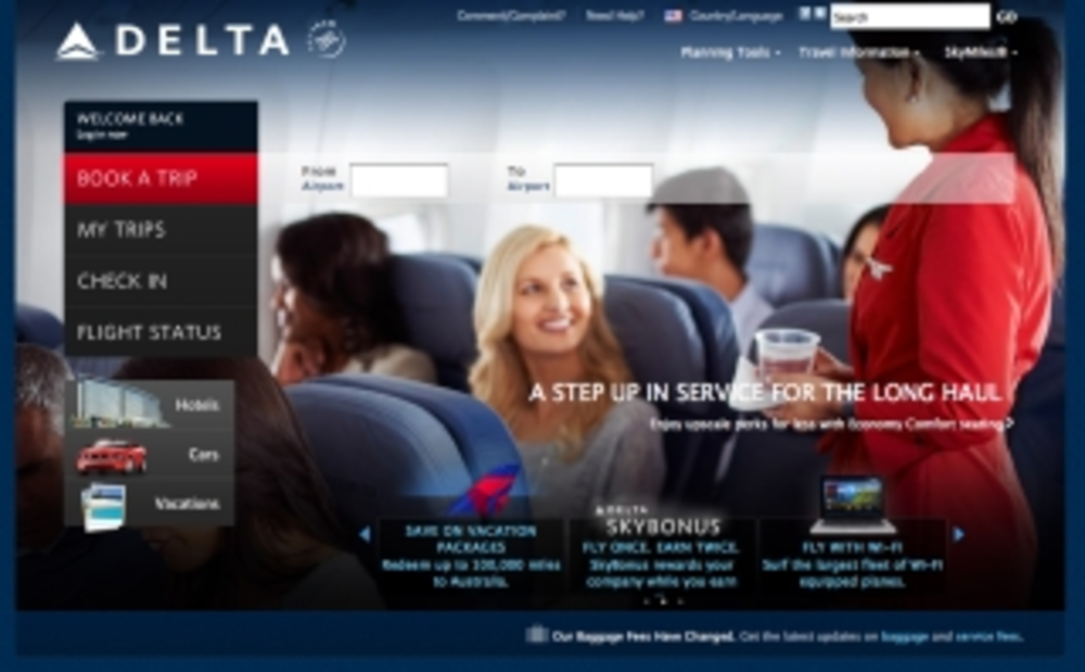
Delta.com’s design — when compared to the chaos of Southwest.com and United.com‘s humdrum layout — is clean and classy, and information is easy to find. Delta foregoes the standard horizontal navigation bar for a vertical bar, which is impressive in its simplicity: “Book a Trip;” “My Trips;” “Check-in;” and “Flight Status.”
Clearly marked icons link to landing pages where visitors can book cars, hotels and vacations.
A recessed, but still noticeable, navigation bar at the top right skillfully hides hefty drop-down menus packed with nitty-gritty information about baggage, special travel needs, in-flight services and Sky Miles, the airline’s loyalty program. Delta.com’s “Best Fair Guarantee,” promoted on the site, gives customers the opportunity to cancel an order within 24 hours for a full refund, no questions asked.
This site is well worth the trip.
Check out more e-commerce sites and see how they rated:
- Gap.com is a sleek, simple and functional apparel website
- DC Comics makes purchasing comics and graphic novels easy
- Laylagrayce.com brings beauty and grace to shopping online
- Lomography.com misses picture-perfect browsing experience
- Several complaints to lodge against Völkl’s ski gear site