American Airlines
Direct mail mirrors interactivity of widget
Situation
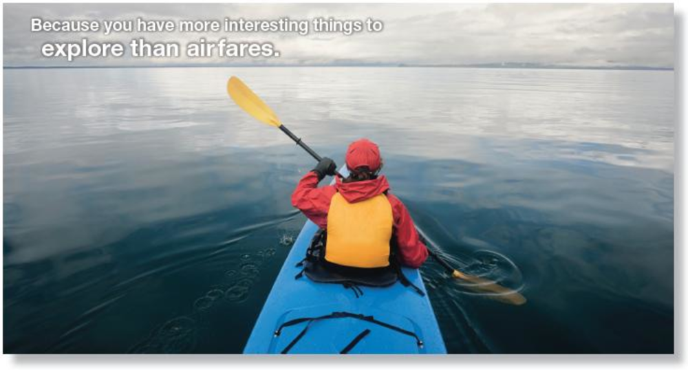
Last summer, American Airlines launched the DealFinder desktop widget that alerts consumers when it finds a flight price and schedule meeting their preferences. The airline needed an effective way to communicate the new tool’s benefits while also building brand awareness.
Approach
American Airlines challenged its promotions agency of record The Marketing Arm to consider a variety of strategies when creating a campaign to support DealFinder’s launch. The result was a direct mail campaign in October and November to three different audiences for a total delivery of 1 million pieces. The six-month long effort also included e-mail and a promotion on AA.com.
“Because DealFinder is an interactive tool and it was being promoted through the mail, the agency wanted to make each piece interactive,” says Scott Biggers, group concept director at The Marketing Arm.
The simplest piece showed a vacation spot on the front and, under a flap, what DealFinder looks like inside. It went to American Airlines’ AAdvantage members. A wheelchart replicating how DealFinder works was mailed to non-AAdvantage customers. Finally, a laminated map that could be used to plan a vacation was sent to members with high incomes and kids. Each piece directed recipients to a URL where they could download DealFinder.
Results
More than 38,000 downloads of DealFinder came from the direct campaign and the direct mail had a response rate of 3.8%. Many wheel chart and map recipients went through the AA.com homepage to download DealFinder. –Chantal Todé
BlueCross BlueShield of South Carolina
Parents enroll grads online for health insurance
Approach: DMW Worldwide first developed the Operation Graduate direct mail campaign in 2004 to drive enrollment of college graduates in health insurance programs for regional partners such as BlueCross BlueShield of South Carolina. Last year, the effort was expanded with a drive in the self-mailers to a Graduating Seniors landing page.
Results: Ten percent of sales came from online. -Mary Hurn
Kodak
Viral contest does the job
Approach: Ostensibly to increase awareness of its EasyShare printer and ink, Kodak created an online contest earlier this year inspired by its sponsorship of The Celebrity Apprentice and leveraging Brickfish’s viral marketing platform. Consumers entered by submitting a photo or video of a treasured personal memory.
Results: More than 4,000 entries were submitted, and branded content was viewed almost 1.5 million times. –Nathan Golia
Privateview
Kevin Foreman Creative director, Rapp Collins Worldwide
The American Airlines campaign is a how-to example of solving a tough, tough challenge. The images are evocative, and the core concept of “We found it!” says it all. Everyone’s desire when shopping airlines is shortened to three powerful words. The “Chart your course” concept is brilliant. All the tools are provided to make your trip as easy as possible — laminated maps, charts and a microsite specific to the DealFinder. The layout and colors keep true to AA graphic standards, yet are also innovative. Everything is clean and easy to navigate. I appreciate the challenge inherent in graphic standards, and AA managed it well.
BlueCross BlueShield of South Carolina makes a bold claim on the cover by stating urgency. But once inside, the piece becomes copy heavy. It’s well designed but overwhelming. A line that was buried, “Many new graduates feel immune…even invincible,” has a strong in-your-face attitude, but this line would have been better in a headline. It drives home why you need to purchase insurance for graduates.
With Donald Trump, Kodak found a unique way of speaking to its audience in an intelligent and meaningful manner. “Pricey ink — you’re fired!” turns the campaign into an anthem cry. It builds camaraderie among all of us pulled down by the high price of printer ink. The call to action buttons, grounded in the consummate cyan, magenta and yellow ink dots, was great.
SEND US YOUR BEST: To submit campaigns and case studies, or to be a reviewer, e-mail [email protected].