Love ‘em or hate ‘em, you have to admire the sheer tenacity of the big, six- by 11-inch Comcast postcard. The offers may change but the pitch is relentless. It seems that every week a new billboard juts out from my stack of bills and catalogs.
The cards, at their best, can deliver maximum impact for minimum dollars. Don’t let high concept and high design get in the way of a big, timely, and competitive offer complemented by an even bigger call to action.
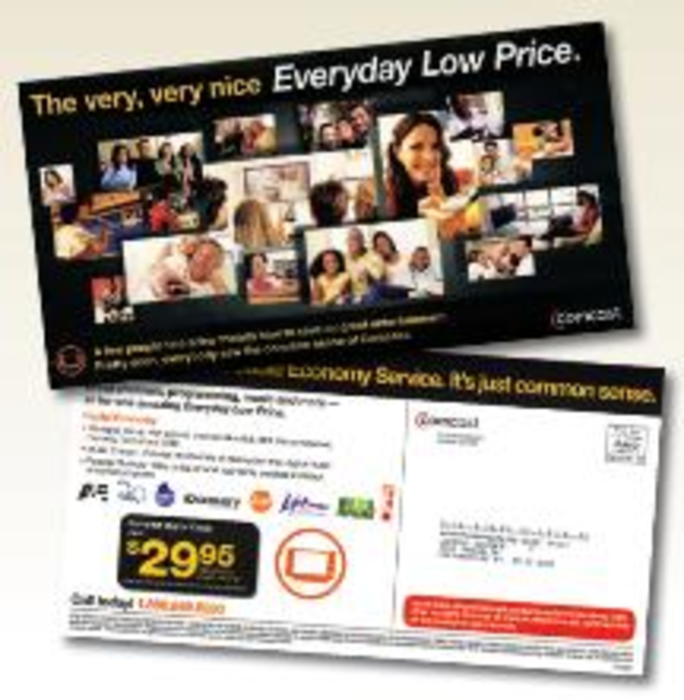
The latest carpet-bombing from Comcast, however, wanders from the proven formula. At a time when most consumers are downsizing their household bills, Comcast makes the right move by promoting an economy service – same great programming, one low price.
Unfortunately, one side of the postcard is littered with small, random stock images of people watching TV. While blurry cooking shows (so much for HD) and gigantic kittens seem to be captivating entertainment for some customers, another Comcast couple is content to sit and watch nothing at all. A rhyming headline and some weak, convoluted copy try to make sense of all the imagery.
The back panel doesn’t fare much better. The ribbon headline spanning all 11 inches is so tightly tracked it almost becomes unreadable. It’s the victim of a long name – Comcast Digital Cable Economy Service. If your product or service has more than threewords in it, it is too long. The low price is nicely showcased. However, the orange Comcast cable icon seems irrelevant and needs to go — then, the offer and call to action could work together better to lift response.
The billboard postcard should be treated like its larger, outdoor namesake – less is more. Its bigness and breakthrough ability can be severely comprised by packing every inch of its frame. A simple flood of color on the front with a big price point and a string of reversed-out network logos is one better approach.
And, from a copy perspective, Comcast should lose the everyday low price jargon. This is a great opportunity to show Comcast is working to help, not hurt, the family budget with a low-cost solution for basic cable needs. That’s just common sense.
Send your Direct Choice to [email protected]