


Search. Found it. Click. Looks good. Click. Go to checkout. Nothing happens. Why?
Another online shopper just disappeared. And with that departure goes another sale. Online merchants really hate that, but sometimes they only have themselves to blame.
The online customer journey can be as straightforward as the sales funnel, but it can also resemble a meandering path through a sales thicket. To guide that customer journey towards its meaningful end, online merchants will have to be savvy operators, prompting that shopper with the right message at the right time to keep them on the path.
Or you can wonder where they went…after they abandon the shopping cart.
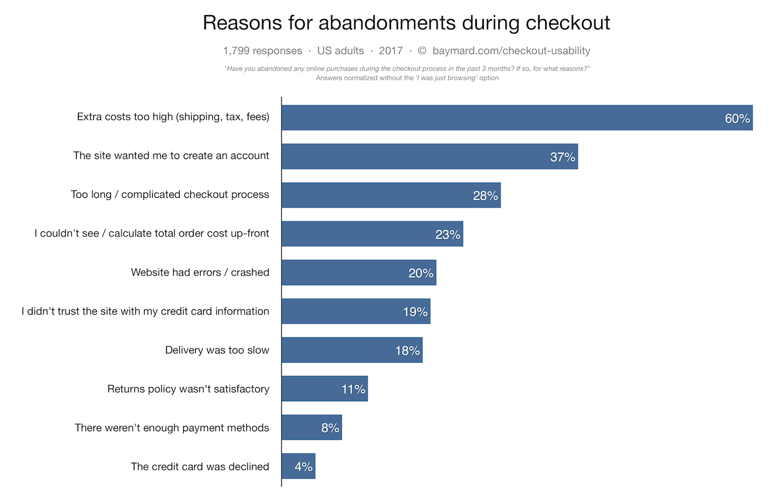
There are many metrics that outline the problem. Shopping cart abandonment is the easiest to measure. Close to 80 percent of all online shoppers walk away from completing their purchases. The reasons why paint a very discouraging picture . Even seemingly unrelated factors can contribute to failure.
We spoke with a number of people who are deeply involved in helping clients optimize their online stores. There are many reasons “why” shoppers fail to complete a sale.
How many clicks should it take to buy a light bulb?
As few as possible. Checkout is where sales are made or broken. According to the experts we spoke with, if checkout is poorly designed, the shopper will be likely to drop out. The mindset of the shopper at checkout is “I want to buy this”. Any other step that gets in the way of that final click can prompt shopper flight.
“The more steps it takes for a shopper to go from click to ship, the higher the abandonment rate you’re going to see.” explained Gurjit Sandhu, Marketing Manager at Yes Marketing.
“They don’t want to come up with a password and register an account. They just want to shop.” said Pawel Ogonowski, COO and co-founder at Growcode. “The user doesn’t want to create an account. They want to check out as a guest.”
One tool shopping sites should use to reduce inconvenience is the “pre-fill”, noted Meghan Stabler, VP for Global Product Marketing, BigCommerce. Put in a zip code? That should generate town/state information on a pulldown. How about that credit card? MasterCard, Visa and Amex all have different grouping styles for card numbers. Inputting your number should result in the card type popping up, rather than making the customer click a card icon before inputting the card number.
“The adding of steps comes from bad programming, and a lack of understanding of the psychology of [the user] or the shopper’s journey” Stabler continued. “What can we do on the back-end to take away complexity?” Fix the problem with a little more coding on the front-end or back-end, and “the user will be grateful,” she said.
Not all who wander are lost
Online shoppers are goal-oriented. They are looking for a specific item they want to buy. Yet their path from search-to-sale can be anything but a straight line. To follow the trail, look at how people move from screen to screen., and where they click.
“The funnel model can be a useful way for marketers to think about acquisition, but this linear model doesn’t really describe many customer journeys. Customers move between channels, and between different sites as they research, compare prices, and finally decide to buy.” said Graham Charlton, Editor in Chief at SalesCycle.
“[I]t’s important to look at behavior [of the shopper] that might not match this general flow, such as circular paths and rage clicking. Those are indications that something is confusing or not meeting expectations.” said Janelle Estes, Chief Insights Officer at UserTesting.
“Behavioral analytics platforms help you understand the general flow of site traffic, how many follow the most direct path, and most importantly where people are falling out of the funnel or abandoning the experience altogether.” Estes continued. “It’s in these meandering moments that sites need to provide contextual help and gentle nudges via links, suggestive content, or even customer chat, to get them back on track. “
Meandering may not be a sign of confusion, however. “This is especially true when there are incentives like extra discounts or free shipping that encourage shoppers to browse for more items.” said Blake Morgan , author and customer experience futurist. Any step where the shopper wavers is an opportunity for retargeting, Ogonowski added. The flick of the mouse shows the shopper about to leave? Deal a pop-up that offers a discount or a coupon. Offer another discount in exchange for shopper’s e-mail address. Even if they abandon the shopping cart, they can be prompted again by e-mail to resume the transaction. (Editor’s note: BigCommerce recently published survey results attributing a significant quantity of cart abandonment to shipping issues.)
All these prompts keep the customer on the purchase path. Serving up prompts to guide the online shopper should be limited to no more than needed, Morgan cautioned. “Extra screens can be useful and helpful if they include deals or relevant recommended products, but once they monopolize the experience…it becomes too much.”
“Twenty-percent of buyers say the purchase process itself is most influential in their decision to buy with a new retailer,” said Sandhu, citing a Yes Marketing study. “ Intrusive ads, non-intuitive design and even now lack of recommendations are sure ways to send customers to competitors.”
It’s all about me
Other less obvious factors can deliver delight or dread.
Online shopping has to “be surrounded by one thing: personalization,” said Stabler. A decade ago,it was enough for the online shopper to search for the item, buy it, and have it shipped. Now, the online store has to be friendlier. “The site must recognize me when I shop there,” Stabler said.
“A strong search function helps customers find exactly what they need, which can lower shopping cart abandonment,” Morgan observed. “Poor search functions that yield too many choices…can lead to shoppers adding more items to their cart, but then ultimately abandoning those items when they second-guess their decisions.” User frustration with the web site can also kill a sale. Note that search, selection and checkout each take a screen. “A critical thing to consider is the time it takes to load the page…in order for the customer to interact.” said Ian Pham, product manager at GTmetrix. A customer may walk away from the site “if each step is preceded by a 2 second blank page or a spinner gif endlessly rotating.” he said. This can be quite galling to the online shopper during an online sales event or promotion. “This is due to the fear of inventory running out and/or missing a window for a sales event – a slow loading site adds even more frustration, as the customer feels it is out of their control and not their fault if they are unable to purchase their desired goods.” Pham said.
Each click is a clue
As with all things digital, every user action leaves a signal that can be analyzed. Learn from those clicks to improve the experience — or increase sales.
The three-click/three-screen rule may not be the way to structure the shopper journey, Ogonowski continued. “When the user finishes shopping, we learn he spent a half-hour or 40 minutes on the web site,” he said.
“[U]nderstanding and optimizing the experience the customer has before getting to the shopping cart is critical. If someone is frustrated when they arrive at the shopping cart page, they are more likely to abandon as compared to someone who has had a seamless and enjoyable experience.” Estes added.
Another way to gather data is not to ask the shopper for all their information at once. An online site can provide a “preference center” where shoppers can talk about their experiences buying or using the product, Sandhu noted. “Marketers have the opportunity to ask customers about their style preferences and favorite product categories, and as a result, can fine tune their data points and gain valuable zero-party insights to make more informed decisions on future content.” (More on zero-party data here.)
“With new data privacy regulations coming in around the world, web users are becoming more aware of how their data might be used.” Charlton noted.”It’s also important that retailers are now clear about how data will be used, and to sell the benefits of sharing data. For example, adding an email address and some key product preferences can help to make emails more relevant to shoppers, and provide benefits like discounts and special deals. If you’re asking for details where the customer can see no relevance to the purchase or benefit to them, then this is too much.” Charlton said.
The sum of all viewpoints
One thing all our experts agreed on is that the online site must offer the shopper a seamless, convenient experience. Designers and retailers should use their own sites, just to be sure. Chances are good that if any feature annoys you, it probably annoys the shoppers, too. “A usable website isn’t one which the designer or CEO thinks is good, it’s one which your shoppers find easy to use and buy from without any unnecessary friction.” Charlton said.

